I Forconi a Torino is an interface designed to visualize tweets sent during the “Forconi” protest in Turin in order to inform fellow citizens about traffic conditions. Developed as an emergency project during the days of the protest, the visualization has been used by the population of Turin to have an overview of the traffic situation in the city.
 In the days between the 9th and 12th of December, the city of Turin experienced mobility problems because of the “Forconi” protest. In that context, Turin citizens, guided by the city’s official Twitter account, have been sending tweets in order to notify about traffic jams and mobility problems by using the #mobiliTO hastag and @twitorino mentions. As a spontaneous, crowdsourced event, the information embedded in the tweets was useful but hardly standardized in its form or contents, and the fragmented nature of tweets made it difficult to have an overview of the situation in Turin.
In order to address the communication issues, the project aimed to collect all the messages related to the protests and visualize any mobility information contained in them on a map in order to provide sensible and easily graspable information for the citizens of Turin.
I Forconi a Torino collects tweets that use either the #mobiliTO hashtag or any @twitorino mentions and uploads them to a database where the contents of the tweets are matched against an OpenStreetMap database containing names and geographic locations of all the city roads. If the text of the tweet contains one or more geographic references, the script looks for informative words and sentences to understand it the mentioned road is blocked by the protest or if it has been cleared.
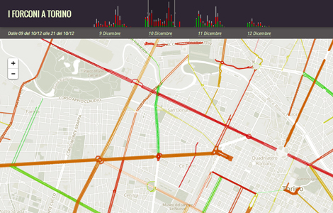
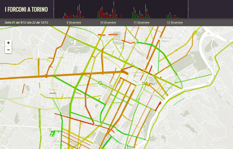 The results of the analysis are then made available to be displayed on the map. Using the coordinates included in the OpenStreetMap database, the geographical entities referenced in the tweets are draw on the map with a color scale that goes from green (free road) to red (blocked road). By clicking on any displayed road segment it is then possible to explore the contents of the actual tweets and verify the classification in positive/negative.
Over the map, a temporal histogram acts as timeline of the events, showing the evolution of the activity in terms of volume of tweets, and their classification in positive and negative sentiment.
Beside the map exploration and the detailed view on the single tweets, the interfaces now allows to explore the temporal dimension of the protest, allowing the user to select the displayed period, either by clicking on the dates or by dragging the slider positioned over the histogram in order to change the highlighted timespan.